03LawConcept
Calloway & Reed
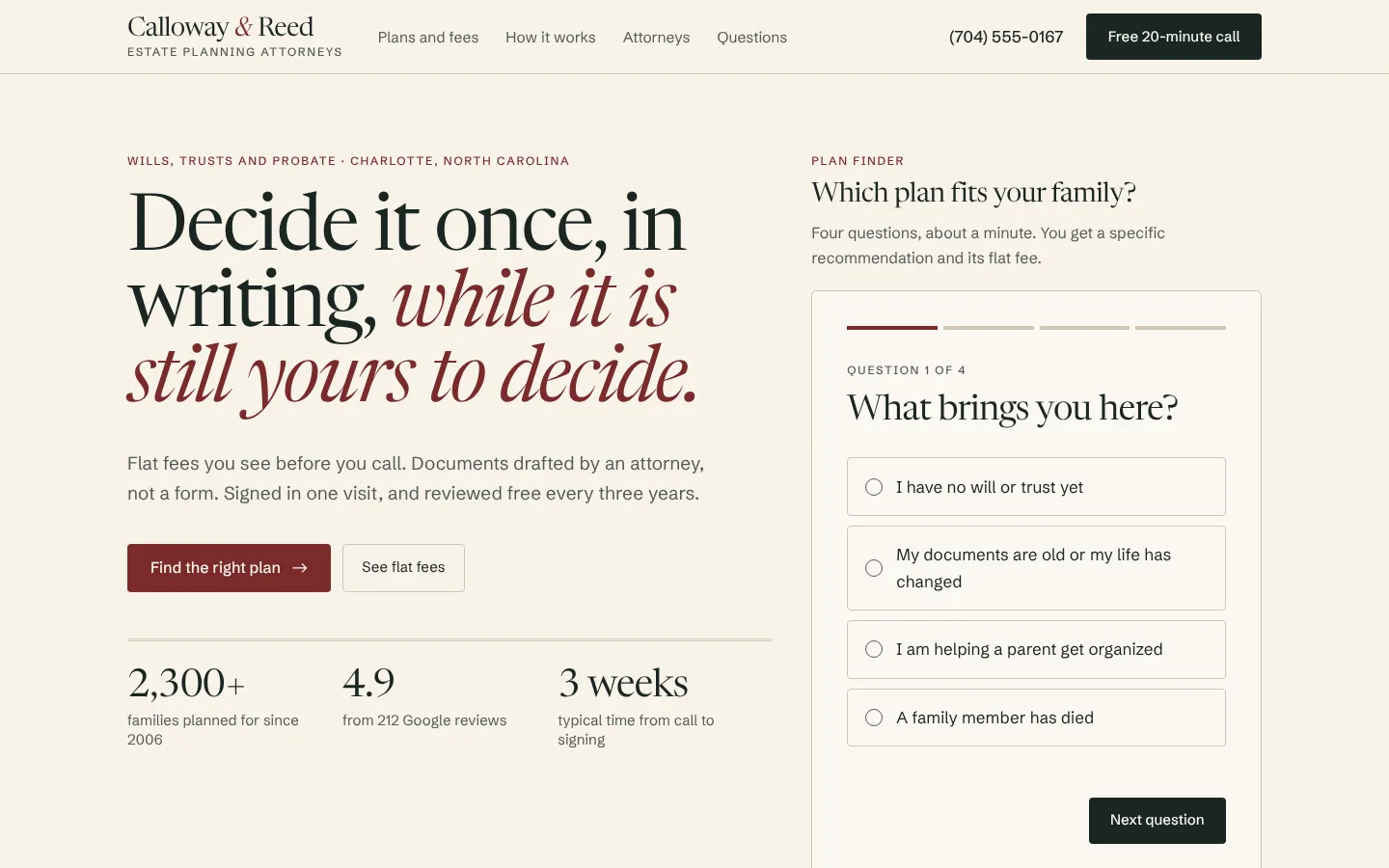
An estate planning firm’s site that does what law firm sites rarely do: prints its fees, recommends a plan in four questions, and explains the whole process in three meetings.
- Sector
- Law
- Scope
- Strategy, design, build
- Stack
- Next.js · TypeScript · Tailwind
- Year
- 2026
Overview
What we built, and why.
Most adults know they should have a will and do not. The two reasons they give are that they do not know what they need, and that they expect a lawyer to cost an unknown, large amount.
Calloway & Reed’s site removes both. The plan finder turns four plain answers into one recommended plan, and that plan’s flat fee is on the page. By the time someone books the free call, they know what they are buying and what it costs.
Project facts
- Brief
- Self-initiated concept
- Deliverables
- One-page site, plan finder, fee table
- Audience
- Parents, homeowners and executors
- Build
- Hand-coded, no page builder
The brief
The brief we set.
Calloway & Reed is a three-attorney firm in Charlotte, North Carolina, that does estate planning and probate and nothing else. It charges flat fees, which is rare enough to be its strongest selling point.
Its clients arrive at a life event: a first child, a house, a parent’s death. They are comparing the firm against online forms that cost a tenth as much, so the site has to show what an attorney adds.
Who it is for
- Primary
- Parents and homeowners with no plan
- Secondary
- Executors after a death
- The decision
- Book a free 20-minute call
Goals & challenges
What it had to do.
Goals
Answer “what do I need?”
Four questions lead to one of four outcomes, each with a plain description and its fee.
Publish the fees
Will plan, trust plan and probate each show a flat fee, with what it covers, before any contact.
Make the process feel short
Three meetings and about three weeks, each step with its length, so it stops feeling like an open-ended legal matter.
Challenges
Branching that stays simple
A death in the family asks a different set of questions from someone planning ahead. Either path is four questions, with a progress bar, a back button and focus that follows the question.
Helpful without giving legal advice
The finder recommends a plan and stops there. Outcomes avoid thresholds and deadlines that change, and the page says plainly that it is illustrative.
Design direction
How it looks, and why.
Bookish and settled: an ivory page, near-black ink and an oxblood accent, set in a serif that reads like a well-made document. No gavels, no columns, no scales.
Palette
Ivory
#F7F3EA
Background
Paper
#FBF8F2
Cards
Ink
#1B2622
Text and dark sections
Oxblood
#7A2B2B
Emphasis and actions
Brass
#B98A3E
Highlights on ink
Type
Display
Newsreader 380, display optical size
clamp(42px, 6.2vw, 82px) / 0.96
Decide it once, in writing.
Body
Schibsted Grotesk 400
17px / 1.65
Flat fees you see before you call.
Labels
Schibsted Grotesk 500
12px / uppercase
Plans and flat fees
Key decisions
Italic for the point of the sentence
Each headline sets its turn in oxblood italic. It is the only decoration on the page.
Fees as large as headlines
The prices are set in the display serif at 40 pixels. If the fee is the selling point, it should not be in small print.
Square corners, double rules
Small radii and title-page rules keep the page feeling like stationery, where the roofing and dental sites are rounder and louder.
Screens
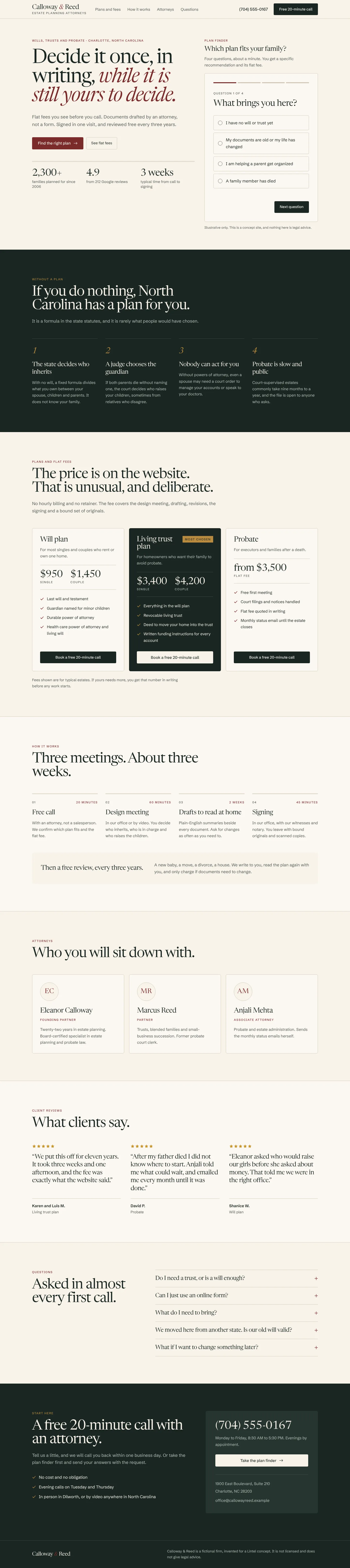
The build, page by page.
Captured from the live concept, not mocked up.
Key features
What it does.
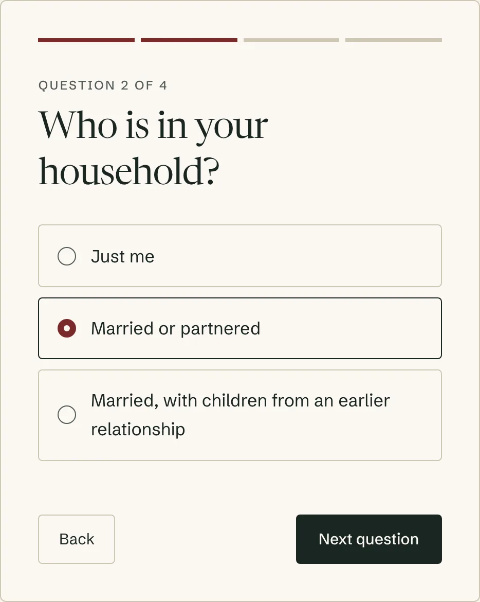
Plan finder
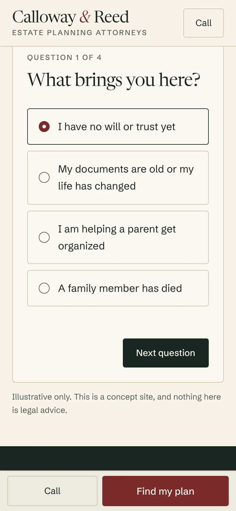
Four questions with branching, one recommended plan, its flat fee, and a call request that carries the answers so nobody asks twice.
Plan finder, question two
Flat-fee plans
Three plans with single and couple prices and exactly what each includes.
The process, timed
Free call, design meeting, drafts and signing, each with its length, followed by a free review every three years.
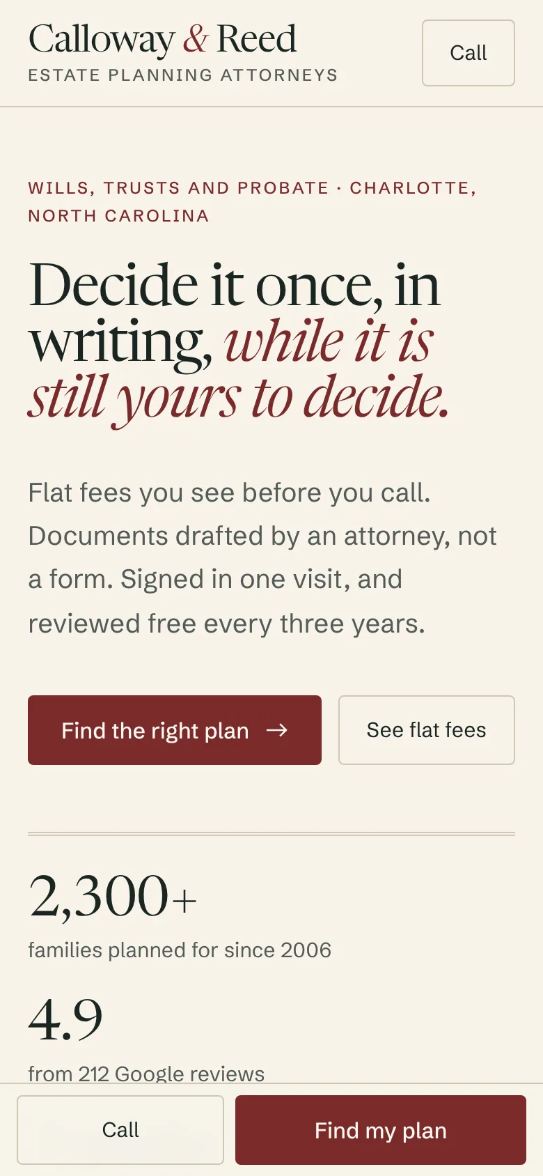
Built for one thumb
On a phone each question fits one screen, and Call and Find my plan stay fixed at the foot.
The plan finder on a phone
Results
Measured, not claimed.
Measured on the live concept with Lighthouse (mobile preset), median of three runs.
Measured on the live concept ·
- Performance
- 96 out of 100
- Accessibility
- 100 out of 100
- Best Practices
- 100 out of 100
- SEO
- 100 out of 100
SEO leaves out Lighthouse’s crawlability check. Concept sites are deliberately set to noindex, so no one mistakes them for real businesses.
- Page weight
- 286 KB
- JavaScript
- 147 KB
- Requests
- 24
- The plan finder is the only interactive component; beyond the framework runtime, the rest of the page is static HTML.
- No photographs and no third-party scripts.
Next
Want this standard for a real business?
Every Lintel project starts with a free recorded audit of your current site. No obligation, and it’s yours to keep.