02DentalConcept
Brightwell Dental
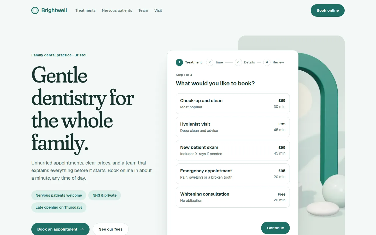
A family dental practice’s site built around one job: taking a nervous patient from “maybe” to a booked appointment in three calm steps.
- Sector
- Dental
- Scope
- Strategy, design, build
- Stack
- Next.js · TypeScript · Tailwind
- Year
- 2026
01Overview
What we built, and why.
Dental practices lose bookings in the gap between intent and action. Someone decides to book a check-up, finds a phone number, and puts it off. Nervous patients put it off for longer.
Brightwell’s site closes that gap. Booking sits on the home page, not behind a “contact us” link: pick a treatment, pick a time, leave your details. Prices are visible before you commit, and nervous patients can say so without making a phone call.
Project facts
- Brief
- Self-initiated concept
- Deliverables
- One-page site, booking flow, fees table
- Audience
- Local families and nervous patients
- Build
- Hand-coded, no booking widget
02The brief
The brief we set.
Brightwell is an independent family practice with NHS and private lists, three dentists and a hygienist. Its patients are local, many are parents booking for children, and a real share are anxious about treatment.
Most enquiries arrive by phone during working hours, when patients are at work. The practice wants those bookings to happen online in the evening, without waiting for reception to open.
Who it is for
- Primary
- Parents booking for the family
- Secondary
- Nervous adults
- The decision
- Book a first appointment
03Goals & challenges
What it had to do.
Goals
Book without a phone call
The whole booking happens on the page, at any hour, in three short steps and a review.
Show prices up front
Every treatment shows its price and length before anyone commits to a time.
Make anxiety easy to mention
One tick box tells the team to book a longer, slower first appointment. No explaining needed.
Challenges
A multi-step form that stays calm
Each step asks one thing, shows where you are and lets you go back without losing anything. Focus moves with you, so keyboard and screen-reader users never get lost.
Availability, shown honestly
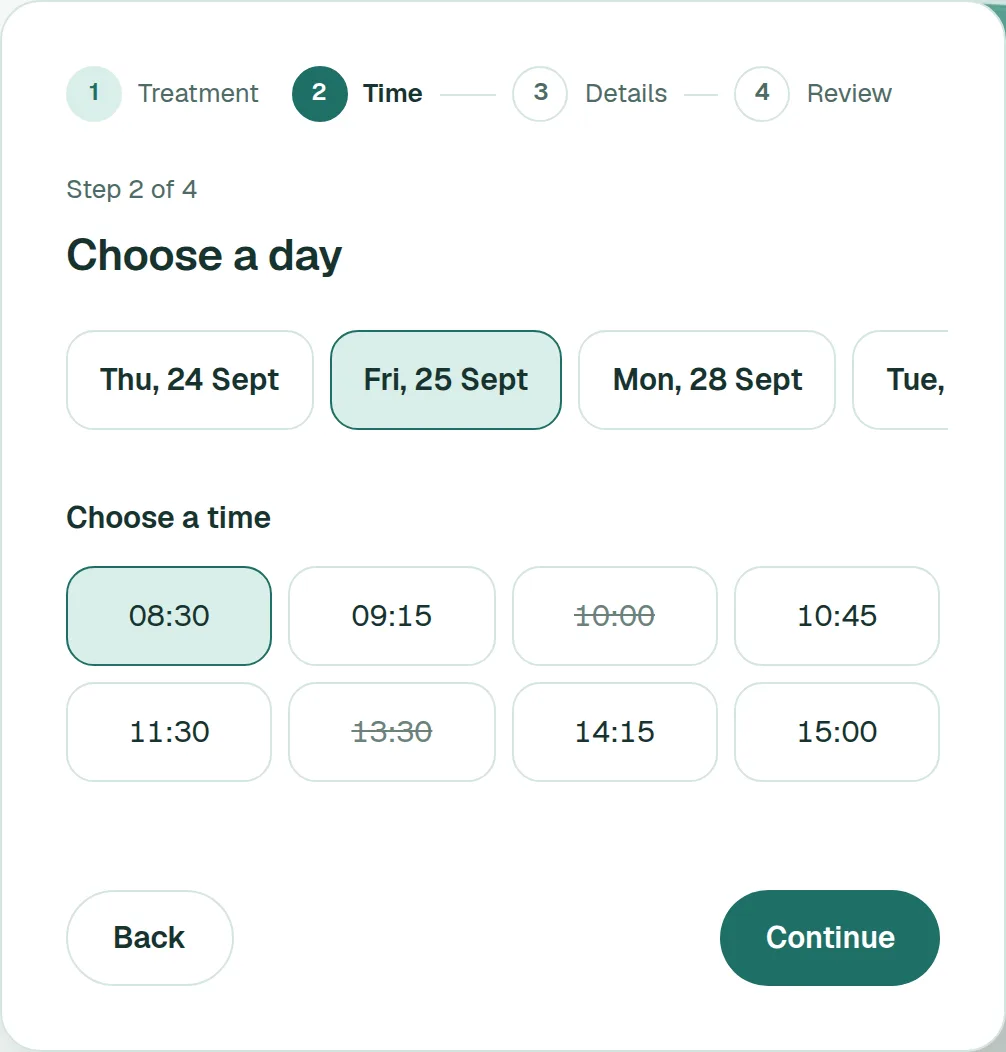
Booked slots are shown struck through rather than hidden, so the diary looks real and the next free time is obvious.
04Design direction
How it looks, and why.
Soft, clean and reassuring: clinical enough to trust, warm enough that it doesn’t feel like a hospital. Instead of stock photos of perfect smiles, a calm rendered still life in the practice’s colours sets the tone behind the booking card.
Palette
Mist
#F4F9F7
Background
Mint
#D9EEE8
Surfaces and badges
Teal
#1F6F67
Actions
Pine
#17332F
Text
Sage
#4F6B66
Secondary text
Type
Display
Fraunces 420, soft axis at 100
clamp(48px, 6.2vw, 86px) / 1
Gentle dentistry for the whole family.
Body
Geist 400
17px / 1.6
Unhurried appointments and clear prices.
Interface
Geist 600
15px
Continue to details
Key decisions
Round, but not childish
Generous radii, pill buttons and a soft serif take the edge off the clinical feel, while the layout stays grown-up.
Teal only means “next”
The one saturated colour marks the way forward through the booking flow. Everything else stays quiet.
Prices beside treatments
Fees sit next to each treatment in the flow and in the table, so cost is never a surprise at the end.
05Screens
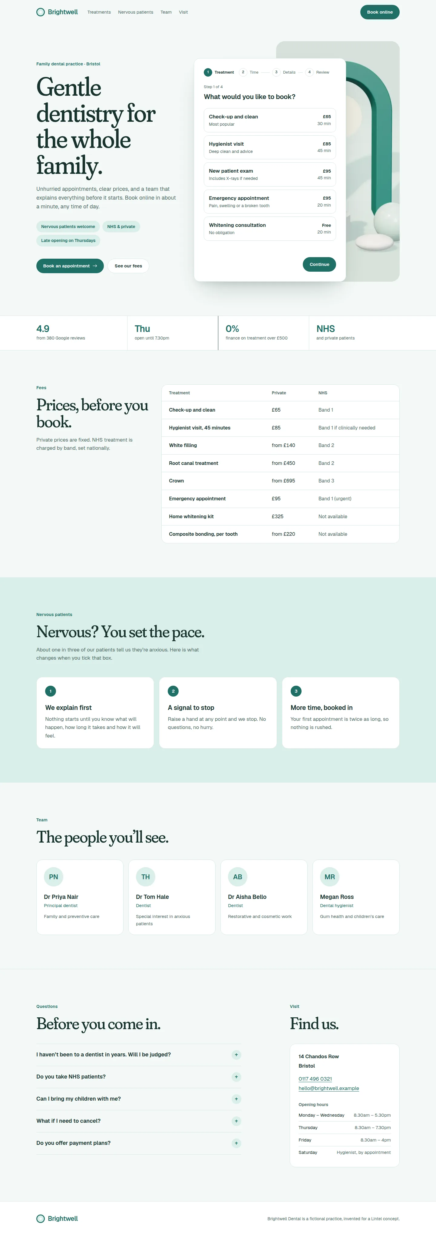
The build, page by page.
Captured from the live concept, not mocked up.
06Key features
What it does.
Multi-step booking
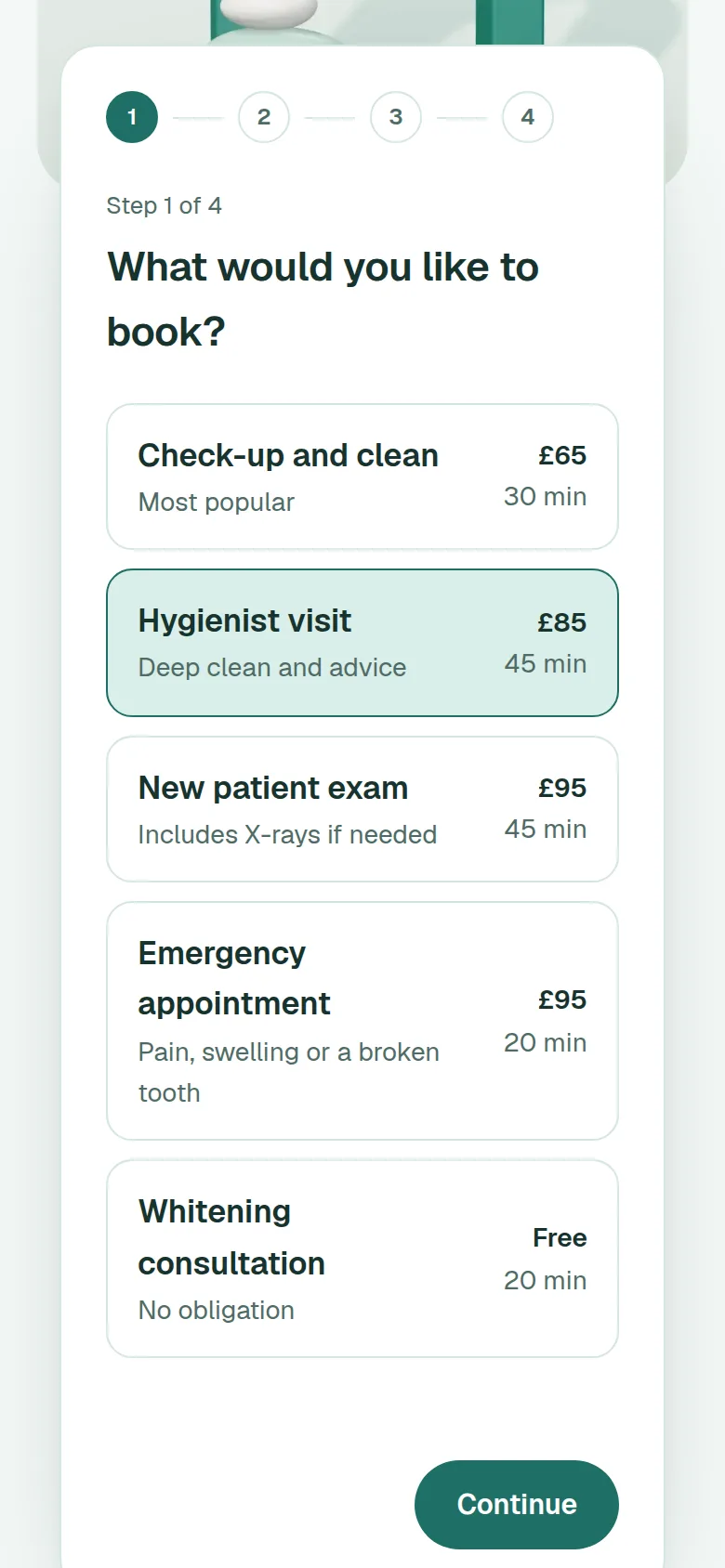
Treatment, time, details, review. Dates are generated live, booked slots are shown honestly, and the flow validates each step before moving on.
Booking, step two: choose a time
Nervous patient flag
One tick box asks the team for a longer first appointment, and the confirmation says what will happen differently.
Fees you can read
Everyday care, cosmetic and restorative work in one table, with NHS and private prices side by side.
Mobile first
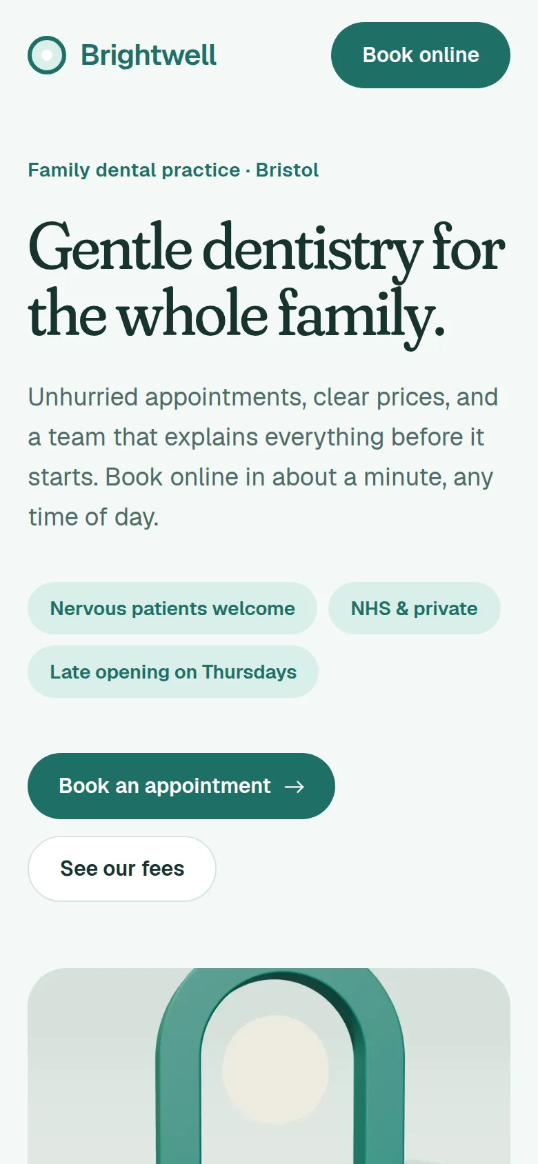
Most bookings happen on a phone in the evening, so every step fits one screen without zooming.
The booking flow on a phone
07Results
Measured, not claimed.
Measured on the live concept with Lighthouse (mobile preset), median of three runs.
Measured on the live concept ·
- Performance
- 95 out of 100
- Accessibility
- 100 out of 100
- Best Practices
- 100 out of 100
- SEO
- 100 out of 100
SEO leaves out Lighthouse’s crawlability check. Concept sites are deliberately set to noindex, so no one mistakes them for real businesses.
- Page weight
- 308 KB
- JavaScript
- 152 KB
- Requests
- 25
- The booking flow is the only interactive component; beyond the framework runtime, the rest of the page is static HTML.
- No third-party booking widget, so no extra scripts, cookies or iframes.
08Next
Want this standard for a real business?
Every Lintel project starts with a free recorded audit of your current site. No obligation, and it’s yours to keep.