03LawConcept
Ashcombe & Rhee
An employment law firm’s site that qualifies enquiries before a partner picks up the phone, set like a broadsheet rather than a brochure.
- Sector
- Law
- Scope
- Strategy, design, build
- Stack
- Next.js · TypeScript · Tailwind
- Year
- 2026
01Overview
What we built, and why.
Employment lawyers spend a surprising share of their week on calls that were never going to become instructions: matters outside the firm’s practice, or people who need ACAS rather than a solicitor.
Ashcombe & Rhee’s site asks four plain questions first. The answers route each person to the right next step: a call with a solicitor, a fixed-fee settlement review, or free help elsewhere. Partners' time goes to the enquiries the firm can actually help with.
Project facts
- Brief
- Self-initiated concept
- Deliverables
- One-page site, case check, call request
- Audience
- Employees and senior executives
- Build
- Hand-coded, no form builder
02The brief
The brief we set.
Ashcombe & Rhee is a two-office employment practice that acts only for individuals — employees and senior executives, never employers. Its work is settlement agreements, dismissals and discrimination claims.
Its clients arrive worried and short of time. They need to know quickly whether the firm can help, what it might cost, and whether it is serious. The site has to carry authority without sounding like a threat.
Who it is for
- Primary
- Employees facing dismissal or a settlement
- Secondary
- Senior executives
- The decision
- Book a call with a solicitor
03Goals & challenges
What it had to do.
Goals
Qualify before the call
Four questions sort enquiries before they reach a partner, and tell each person what to do next.
Be plain about fees
Fixed fees where the work allows, and a clear note that employers often pay for settlement advice.
Read like authority, not advertising
Typography and restraint do the persuading. No handshake photos, no countdown timers.
Challenges
Branching without dead ends
Every path through the questions ends with a useful next step, including when the honest answer is “not us”.
Plain English without legal claims
Employment law changes, so the questions avoid thresholds that could date. Outcomes say what to do next, not what the law is, and the page says clearly that it is not legal advice.
04Design direction
How it looks, and why.
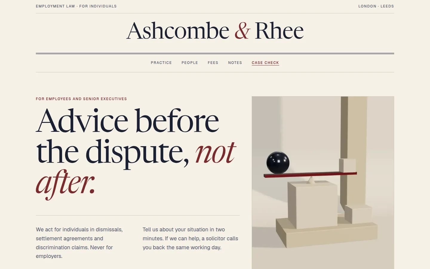
Editorial and serif-led, like a well-set broadsheet: authority comes from typography and restraint, not from stock photos of handshakes. The one image is a rendered plate about balance, captioned like a feature.
Palette
Ivory
#F6F1E7
Background
Ink
#1A2031
Text and rules
Slate
#545A6A
Secondary text
Linen
#CFC6B4
Hairlines
Oxblood
#7A2B2B
Accents and progress
Type
Display
Newsreader 380, display optical size, italic for emphasis
clamp(52px, 7.4vw, 112px) / 0.96
Advice before the dispute, not after.
Body
Geist 400
17px / 1.65
We act for individuals, never for employers.
Labels
Geist 500, letter-spaced capitals
12px / 0.14em
For employees and senior executives
Key decisions
A masthead, not a logo bar
The name is set centred between two rules, like a newspaper. It says “established” before a word of copy is read.
Italic for the turn of phrase
Italic is used once per heading, on the words that carry the argument, never for decoration.
Oxblood marks progress
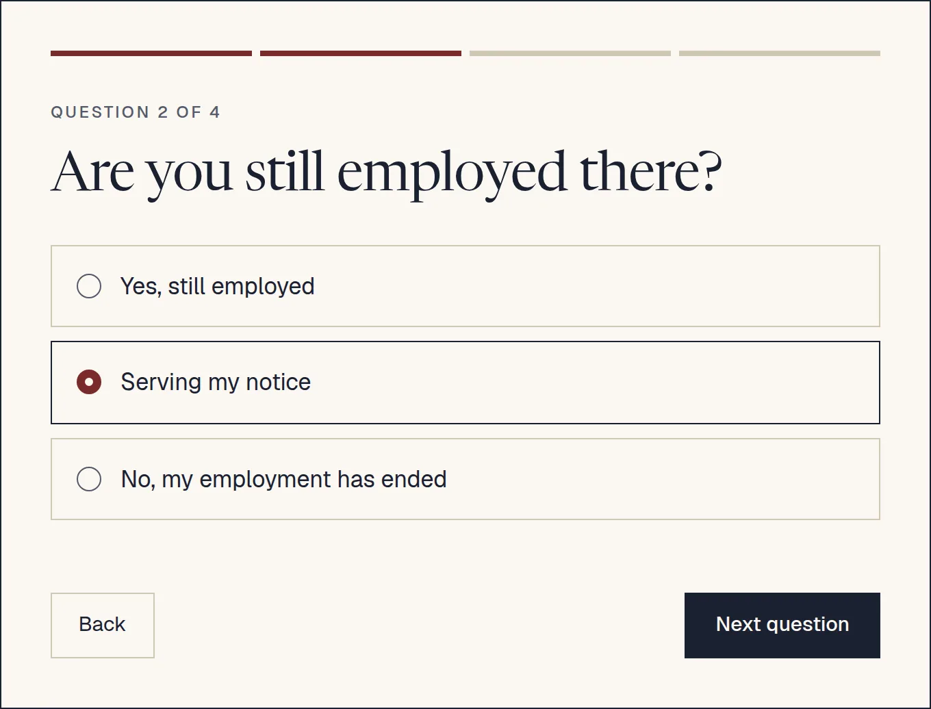
The one accent colour tracks your place in the case check and highlights your chosen answer.
05Screens
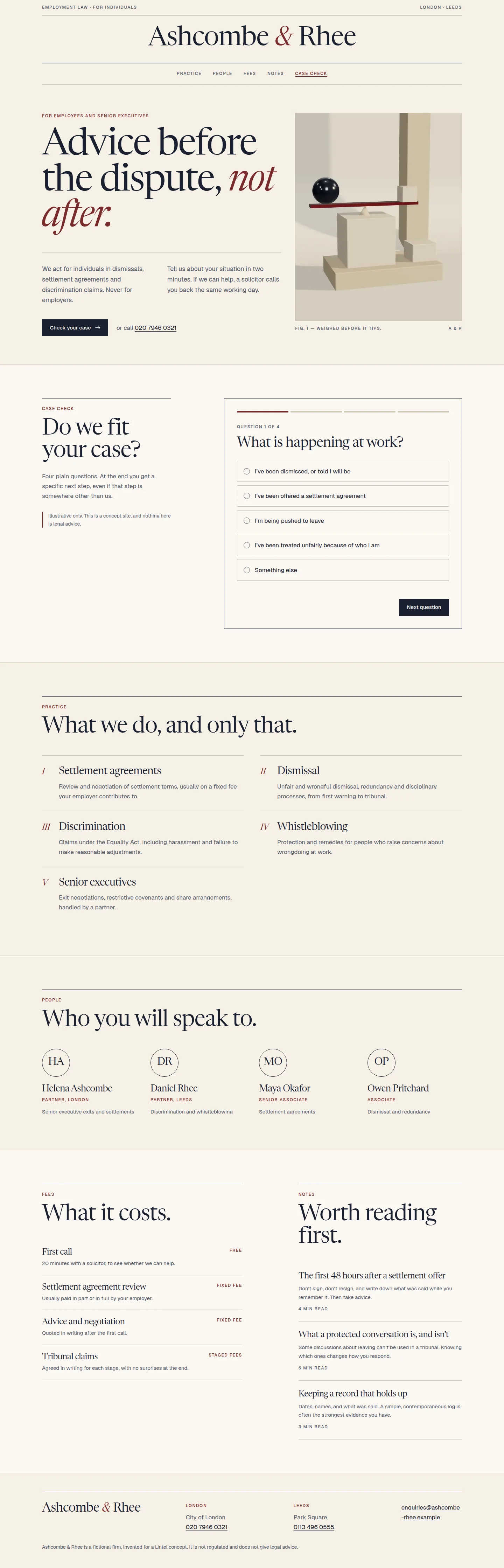
The build, page by page.
Captured from the live concept, not mocked up.
06Key features
What it does.
Case check
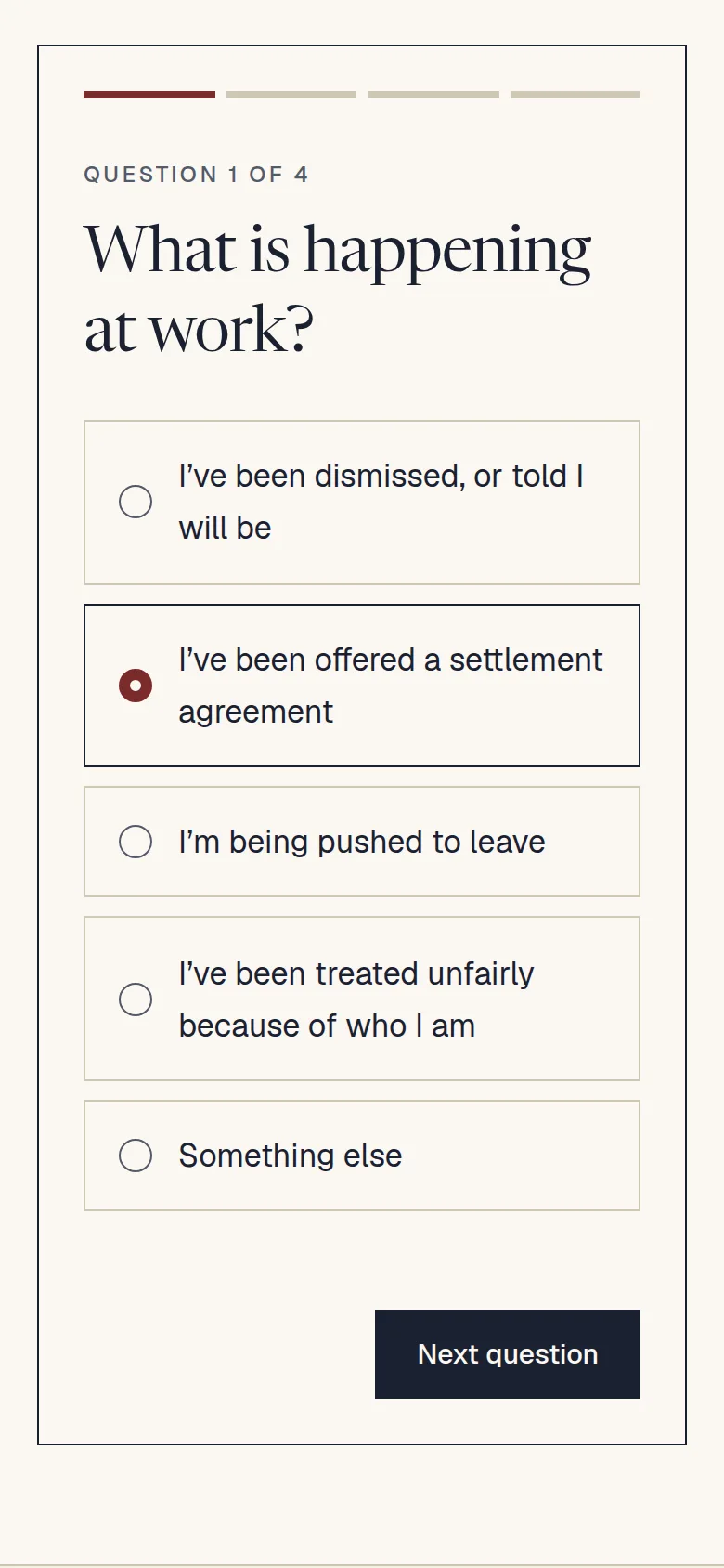
Four plain questions with branching follow-ups. Each outcome gives a specific next step: book a call, request a fixed-fee settlement review, or contact ACAS.
The case check, question two of four
Call request with context
When the check says the firm can help, the call request carries the answers with it, so nobody asks the same questions twice.
Fees stated plainly
A short fees section explains what is fixed, what is hourly, and when an employer usually pays.
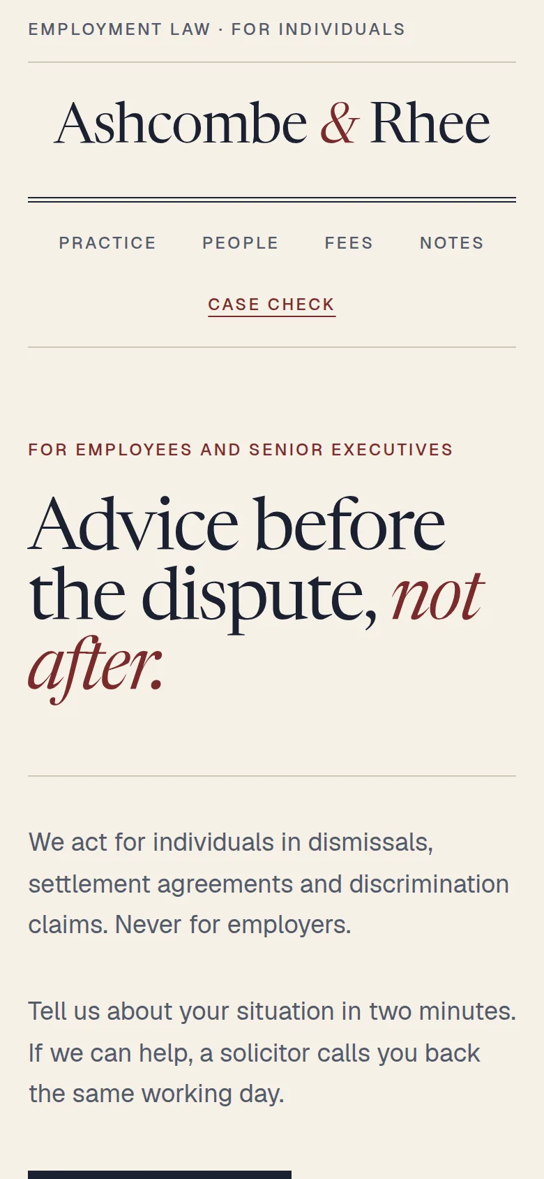
Readable on a phone
Serif type at comfortable sizes and one question per screen keep the check calm on a small display.
The case check on a phone
07Results
Measured, not claimed.
Measured on the live concept with Lighthouse (mobile preset), median of three runs.
Measured on the live concept ·
- Performance
- 96 out of 100
- Accessibility
- 100 out of 100
- Best Practices
- 100 out of 100
- SEO
- 100 out of 100
SEO leaves out Lighthouse’s crawlability check. Concept sites are deliberately set to noindex, so no one mistakes them for real businesses.
- Page weight
- 322 KB
- JavaScript
- 151 KB
- Requests
- 26
- The case check is the only interactive component; beyond the framework runtime, the rest of the page is static HTML.
- No form service or third-party scripts: nothing leaves the browser.
08Next
Want this standard for a real business?
Every Lintel project starts with a free recorded audit of your current site. No obligation, and it’s yours to keep.